Hi folks,
Here I would like to share my experience and learnings on Semantic UI React.
I started exploring Semantic UI for my project.
Getting Started
Semantic UI is the official React integration for Semantic UI.
Here I'm going to use Semantic UI in Create React App. For that, we have to follow the below steps in terminal
npx create-react-app semantic-example
cd semantic-example
npm start
Then install the Semantic UI npm package by
npm install semantic-ui-react
Now semantic UI React package integrated with our semantic-example folder.
react.semantic-ui.com is the official web page of semantic UI React to learn. In semantic UI React, each one is tagged as a component. We import these components and use them in our project. Some components are listed below:
- Button
- Header
- Icon
- Modal
- Card
Example
For instance, if we want to import a Button, using the below Import statement on top of the file. Here we are importing the Button component from the Semantic UI package.
import { Button } from 'semantic-ui-react'
And we use it in like below
<Button>Ok</Button>
 (or)
 <Button content='Ok' />
For example, a full component is looking like as below
import React from 'react';
import { Button } from 'semantic-ui-react';

const ButtonExample = () => <Button>Click Here</Button>
export default ButtonExample;

Bootstrap vs Semantic UI React
Both belong to the CSS framework. UI designers at the beginner level are much familiar with Bootstrap. When compared to bootstrap, Semantic UI React is easily understandable.
One interesting fact about the Grid column is in Bootstrap, each Grid row has 12 columns. But Semantic UI React has 16 columns.
For example card in Bootstrap, we have to add class="card" for div tag.
<div class="card">
  <img class="card-img-top" src="" alt="Card image">
  <div class="card-body">
    <h3 class="card-title">Card title</h3>
    <p class="card-text">Card content</p>
  </div>
</div>
Code for Card in Semantic UI React:
<Card>
     <Image src='"" alt=""/>
     <Card.Content>
        <Card.Header>Card Header<Card.Header>
        <Card.Description>Card description</Card.Description>
     </Card.Content>
</Card>
More about Semantic UI React
Grid is the most important for a responsive view of the site.
Each grid is divided into Rows and Columns in which each row has 16 columns. (Which I have already mentioned)
<Grid>
  <h3>Row 1</h3>
  <Grid.Row>
     <Grid.Column computer={8} mobile={16} tablet={8}>Column 1 </Grid.Column>
     <Grid.Column computer={8} mobile={16} tablet={8}>Column 2 </Grid.Column>
  </Grid.Row>
  <h3>Row 2</h3>
  <Grid.Row>
     <Grid.Column computer={8} mobile={16} tablet={8}>Column 1 </Grid.Column>
     <Grid.Column computer={8} mobile={16} tablet={8}>Column 2 </Grid.Column>
  </Grid.Row>
</Grid>
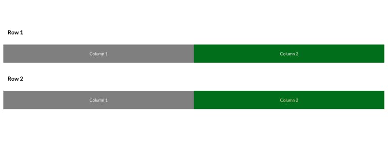
The above code snippet will look exactly like this on the desktop view

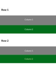
The mobile view will be like below

Here we use grid columns for each responsive view as computer={8} mobile={16} tablet={8}.
In Semantic UI React, we can import and use each component easily and those are very understandable for beginners.
Hope you all had an idea of Semantic UI React which I have shared with you all here.
Happy Journey with Semantic UI React!!!
